

when you build for accessibility from the ground up
What happens when you rebuild a law firm website with accessibility from the ground up? A faster, cleaner, fully manageable platform designed to grow with the business.
Reader tracker
0%
"My website is broken, and it's not accessible. I need something new."
That was how Matthew Agnew of Agnew Law opened the conversation, and in that moment, the scope of the project was already clear.
But to understand how we got there, it's worth stepping back for a second.
Matthew and I had known each other for years before this project. After reconnecting over coffee, he learned that I had moved into freelance web development and started sharing his frustrations with his existing site.
Accessibility was his biggest concern. He knew the site wasn't usable for everyone, and beyond that, it simply didn't feel good to use. The flow was clunky, the experience felt dated, and even small content updates required going through a developer. What should have been a business asset had become a bottleneck.
That combination - poor accessibility, limited control, and a frustrating user experience - is more common than most businesses realize.
Most firms don't think about accessibility until it becomes a problem. And even then, the instinct is usually to patch what's there.
Agnew Law took a different approach.
They made accessibility a priority from the start, and that decision shaped everything that followed.
The Problem: what we started with
Before I took on the project, Matthew asked a simple but important question:
Can this site be fixed, or does it need to be rebuilt?
Like any business owner, he wasn't looking for the most expensive solution. He wanted the most efficient one. So the first step was a full evaluation of the existing site.
To their credit, another team had already come in and improved parts of the website. They did good work with what they had. But even with those improvements, there were still clear signs of deeper, structural issues, especially around accessibility.
And that's where things started to break down.
Accessibility isn't optional
Accessibility ensures that a website works for:
Keyboard-only users
Screen reader users
Users with visual impairments
Anyone using assistive technology
But here's the key:
When you build for accessibility, you don't just help a small group of users: you make the experience better for everyone
Think of a ramp outside a building. If you can walk, you can take the stairs, but the ramp is still easier. And if you need it, it's the difference between access and no access at all.
Websites work the same way.
When accessibility is ignored, most users won't be able to explain what's wrong, but they'll feel it. The site feels harder to use, slower, and less intuitive.
That's exactly what was happening here.
a red sea of accessibility issues
When I ran an accessibility scan using WAVE, the results made the problem immediately clear.
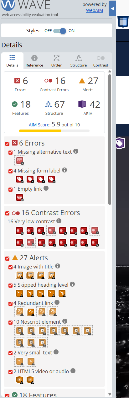
The site wasn't just slightly off, it had fundamental issues:
Missing alternative text on images
Missing form labels (no context for screen readers)
Empty links
Multiple contrast failures
Broken heading structure
Redundant navigation elements
These aren't minor issues. They prevent assistive technologies, and even search engines, from properly understanding and navigating the site.
So this wasn't just an accessibility problem. It was a usability problem. And an SEO problem.
Navigation that led nowhere
Digging deeper, the navigation revealed one of the most critical failures.
Most links on the site gave no meaningful context. And when navigating with a keyboard, there was little to no indication of where you were on the page.
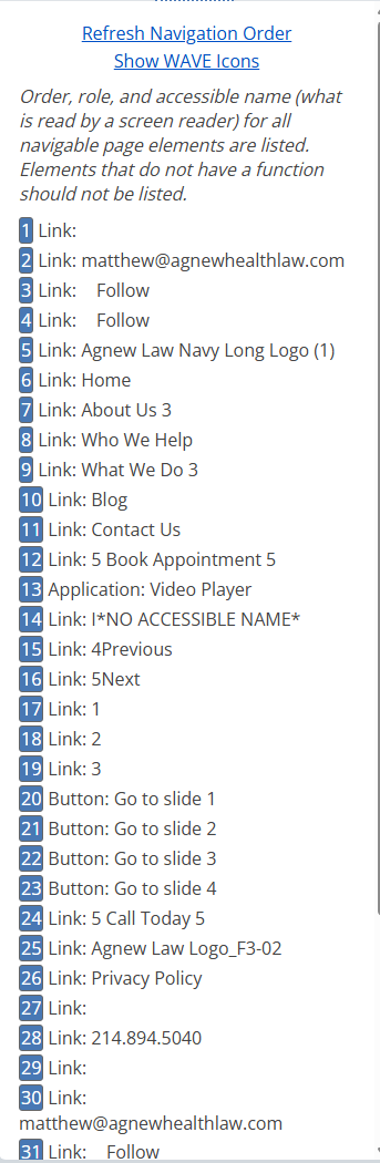
For screen readers, the experience was even worse. Instead of hearing:
Contact us
Users would hear
Link
No context. No meaning. No direction.
At that point, the site becomes effectively unusable, not just for accessibility users, but for search engines trying to understand page structure and relationships.
That lack of structure also showed up in indexing. Without a clear link hierarchy or even a sitemap, the site's SEO was fragmented and inconsistent.
off with his head(ing)
Another major issue was the heading hierarchy. Headings (H1-H6) act like an outline for your content. They tell users, and search engines, what matters most and how information is organized.
Think of them like sections in an essay:
Title
Sections
Subsections
When used correctly, they create a predictable, easy-to-follow structure.
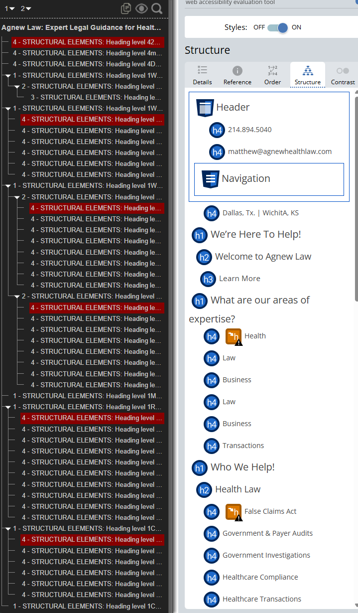
On the existing site, there was no clear order. Headings were skipped, levels were inconsistent, and structure was fragmented.
The result?
Screen readers couldn't navigate effectively, search engines struggled to interpret content, and users had no clear visual hierarchy to follow.
In short, the site lacked a logical flow.
contrast isn't just about beauty, it's about accessibility
Finally, there was contrast.
On paper, this might sound like a purely visual problem, but it's one of the most critical accessibility factors.
In several places, text contrast ratios were around 1:2.5, far below accessibility standards. That means:
Hard to read for average readers
Extremely difficult for colorblind users
Fatiguing even for someone used to staring at screens all day
After a few hours of reviewing the site, even I started to feel the strain.
And if it's difficult for someone trained to look at interfaces all day, it's a serious problem for everyone else.
Accessibility, SEO, and a broken foundation
By the time the evaluation was complete, the pattern was clear: This wasn't a site with a few issues. It was a site built on a foundation that worked against its users.
Poor accessibility
Slow performance
Weak structure
Limited SEO visibility
Matthew already knew something wasn't right; that's why he reached out. The question now wasn't if the site needed improvement. It was how far we needed to go to fix it properly.
the decision: why a full rebuild (not a patch)
At this point, I was faced with two options:
Keep everything as-is and try to work within the existing builder, patching issues where possible and pushing the platform as far as it could go.
Bite the bullet, invest a bit more upfront, and rebuild the site from the ground up.
Why a patch didn't make sense
After reviewing the codebase, the answer became pretty clear.
The site wasn't just flawed, it was fundamentally limited by how it was built.
At its core, the structure was what developers call "div soup." Layers of non-semantic containers with no meaningful hierarchy. There was little to no use of semantic HTML, which meant accessibility wasn't just broken at the surface, it was missing at the foundation.
And that was only part of the problem.
Other issues, like slow performance, clunky interactions, and visual inconsistencies, weren't things you could fix with small tweaks. They were baked into the architecture itself.
You can't optimize a system that wasn't designed to be optimized.
Fixing those issues would have required digging into the base code anyway. At that point, you're no longer patching; you're rebuilding in pieces, which is often slower, messier, and more expensive in the long run.
The bigger picture
Beyond the technical issues, there were practical business limitations.
No way for Matthew or his team to update content
No internal system for managing services, attorneys, or blog posts
Poor mobile experience, borderline usable in some cases
Slow, inconsistent performance across devices
This wasn't just a development problem; it was a usability and scalability problem. It's akin to building a skyscraper on sand and putting in absolutely no reinforcements; at some point, everything will come crashing down.
alignment on the right decision
One of the best parts of this project was alignment across everyone involved.
The team that had previously worked on the site, who had done a solid job improving what they could, also agreed that the current system had reached its limit.
Matthew and his partners saw the same thing.
Everyone understood that continuing to patch the site would only delay the inevitable.
There's a point in every system where incremental fixes stop making sense. This was that point.
Some problems can't be fixed with plug-ins or quick fixes; they require a different foundation
With that decision made, the objective became clear: Rebuild Agnew Law's website into a platform that was:
Fully accessible from the ground up
Mobile-first and responsive across all devices
Fast, stable, and performant
Easy to manage through a custom admin system
Flexible enough to grow with the firm
Not just a better-looking website, but a better system.
the approach: accessibility from day one
Matthew and his partners wanted accessibility built into the contract that we signed, that's how serious they were about getting a website that worked for everyone. With clients like that, I admit that I was spoiled.
That said, there were other aspects that needed to be fixed. This broke down into three things:
Accessibility first in every component
A structured content system
Performance as a feature
Accessibility as a cornerstone
From the beginning, I knew this couldn't just be a website, it had to be a system.
Agnew Law needed more than a static marketing page. They needed a platform their team could log into, manage, and trust over time. A platform that stayed accessible, performant, and clean as it grew.
That meant one thing:
Accessibility couldn't be something we "added later." It had to be built into the foundation
That philosophy extended beyond the public site and into the admin panel. That, too, was built to meet the same accessibility standards.
Why?
Because when the foundation is accessible, everything built on top of it benefits.
it's a matter of semantics
There's a common criticism of modern frameworks like React and Nextjs:
This is where semantic HTML goes to die.
And honestly...sometimes that's true.
But it doesn't have to be.
In this build, I leaned into a component-driven system that enforces semantic structure instead of ignoring it.
Here's a simplified example from the project:
export const Heading = ({
  as: Tag,
  size,
  children,
  className,
  ...rest
}: HeadingProps) => {
  return (
    <Tag
      className={clsx(styles.heading, styles[`heading--${size}`], className)}
      {...rest}
    >
      {children}
    </Tag>
  )
}
<Heading as='h2' size='section' id='related-posts-heading'>
Related Posts
</Heading>Every time a heading is used, the developer is required to:
Choose the correct heading level (H1-H6)
Define its visual size
Optionally assign IDs for accessibility relationships
The result?
<h2 class="Heading-module-scss.module__huinga__heading--section" id="latest-posts-heading">
     Latest Posts
</h2>
This pattern ensures consistency and prevents the kind of structural chaos that existed in the original site.
On a team, it also creates guardrails, making it harder to accidentally break accessibility.
Accessibility should never be an add-on: it should always be a core feature
Accessibility isn't a checklist at the end of a project. It's a system of decisions made throughout.
Clear, meaningful labels
Every interactive element needed to do one of two things:
Clearly explain itself through visible text
Or provide context through screen-reader support (ARIA, sr-only text)
No more "Link...Link...Link..." situations. Every interaction had meaning.
tab and click should matter
One of the most frustrating parts of the old site was the lack of a focus state.
You could tab through it, but you had no idea where you were!
So I implemented a consistent focus system using SCSS mixins:
@mixin focus-ring {
outline: 4px solid transparent;
      outline-offset: 4px;
      outline-color: var(--color-focus);
}

@mixin focused {
    &:focus-visible {
        @include focus-ring;
    }

    &:focus:not(:focus-visible) {
        outline: none;
        box-shadow: none;
    }
}
The goal was simple:
When you tab, you should feel where you are
Consistency here isn't just aesthetic, it's functional. It trains users to understand the interface.
Structured content system
Beyond accessibility, the site needed to be usable internally.
Matthew didn't want his team editing everything, but he did want control over the parts that change regularly.
So the system was built to manage:
Services
Attorney profiles
Blog posts
Client reviews
All through a custom CMS.
This turns the website from a static asset into a living system, one that can evolve without developer intervention.
performance as a feature
The original site felt slow, and not just because of images.
It carried the weight of a "build-your-own" system:
Unnecessary scripts
Excess styling overhead
Limited control over optimization
The goal for the rebuilt was to treat performance as a core feature:
Reduce script overhead
Optimize rendering
Use a modern framework with efficient delivery
Why nextjs? (Yes, even with the trade-offs)
This is where things got interesting.
At first glance, using a framework like Next.js might seem counterintuitive if your goal is to reduce overhead.
And I considered going fully vanilla.
But there was a trade-off:
Vanilla build: Maximum control, slower development
Next.js: Faster build, slightly more overhead
With an upcoming marketing campaign deadline, speed mattered.
So I chose Next.js.
The goal wasn't theoretical performance; it was real-world performance.
Because the site itself isn't massive, most of that overhead isn't noticeable to users. The result is a site that still feels fast, while allowing for rapid development and long-term scalability.
The result of this approach
By focusing on
Semantic structure
Accessibility-first development
Consistent interaction patterns
A scalable content system
Performance-conscious decisions
The site was rethought from the ground up. Not as a page, but as a platform.
the build: what was delivered
To bring this project to life, the goal wasn't so much to build a website as it was to build a system that could scale, perform, and remain accessible over time.
That required a modern stack, a structured approach, and a clear decision at every level of the build.
The stack
To accomplish the goals of the project, I used:
Next.js as the framework, with React as the core library
A custom component system (my own "bootstrap") for consistent, reusable UI
Headless UI for accessible interactive elements
SCSS/SASS for styling
Framer Motion for controlled, intentional animations
This combination allowed for rapid development while maintaining full control over accessibility, performance, and design consistency.
backing up the backend
Before touching design, I focused on structure. The first question wasn't "What should it look like?" It was "What does the system need to support?"
Using Prisma, I designed the data layer and connected it to a third-party service for database hosting and authentication.
From the start, the system was built to support:
Blog publishing
Services and dynamic categories
Attorney profiles
Client reviews
Role-based user permissions
That meant setting up users and authentication early, before any UI work began.
Because if the data model is wrong, everything built on top of it breaks later.
Figuring out the figma
The original Agnew Law website wasn't poorly designed; it was just poorly executed. There was a clear intention behind it, and my goal wasn't to throw that away; it was to refine it.
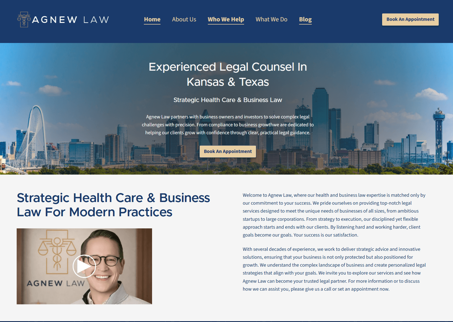
One example was the homepage hero.
The original experience used a video flying over the Dallas skyline and Wichita's Arkansas River. It was visually interesting, but also disorienting, with no way to pause or disable it.
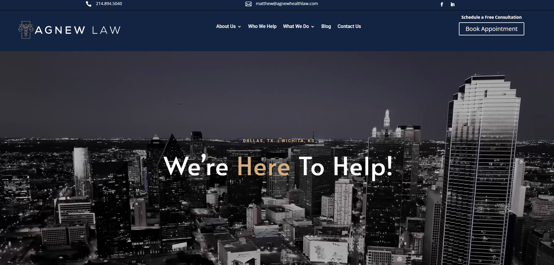
The solution was simpler and more effective:
Replace the video with static imagery
Add a controlled overlay
Anchor the experience with clear branding
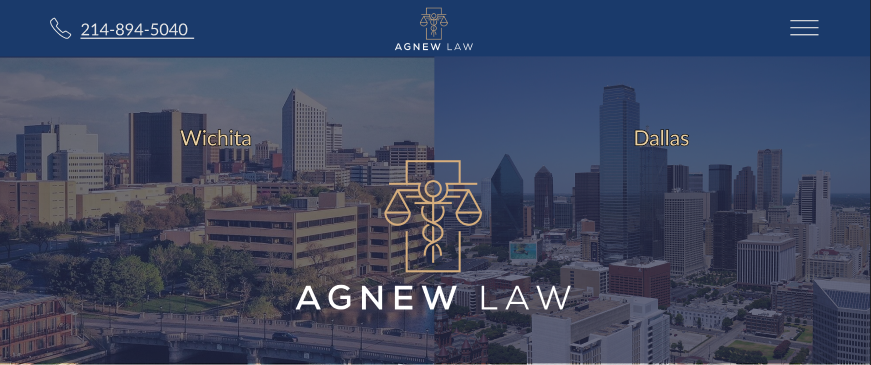
This reduced complexity, improved performance, and created a more stable, accessible experience.
And importantly, it left room for future upgrades with custom photography.
Developing the design
From there, the focus shifted to building a consistent, scalable frontend system. I used my own component architecture, combining:
SCSS modules
Utility classes
CSS variables
SASS functions and mixins
This hybrid approach allows flexibility where needed, while maintaining consistency across the entire site.
Components were organized by function and reused across the platform, ensuring:
Predictable behavior
Easier updates
Long-term maintainability
Accessibility as a development constraint
Throughout the build, every feature had to pass two tests:
Does it work?
Is it accessible?
If data didn't render correctly, the component wasn't finished. If it failed an accessibility check, it wasn't finished.
No exceptions.
This created a natural feedback loop where accessibility wasn't something to revisit later, it was part of the definition of "done."
The result is a fully custom system
By the end of the build, the site had evolved into a fully custom platform with:
A reusable component system
A structured backend with role-based permissions
A dynamic CMS for content management
A consistent, accessible UI across all pages
nerdy numbers
For those who like to see the scope:
27,711 lines of code
695 files
262 folders
183 custom components
182 custom style files
This wasn't a template; it wasn't a modified theme. It was a fully custom-built design to support the firm long-term.
the results: before vs after
By the time the rebuild was complete, the difference wasn't subtle. This wasn't a "slightly improved" website. It was a complete transformation; from a system that worked against users to one built for them.
a clean slate
Before the rebuild, accessibility scans showed a sea of red: errors, warnings, and structural issues across the entire site.
After the rebuild:
0 accessibility errors
0 contrast errors
A near-perfect score across the board
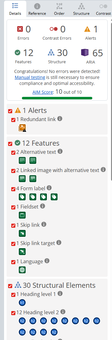
The only remaining flag was a redundant link, caused by the logo sitting next to a "Home" link.
And frankly, that's acceptable.
With a "skip to content" link at the top of every page, users navigating via keyboard or assistive tech can bypass the header entirely. For everyone else, it's invisible.
a beautiful link tree
One of the biggest improvements came from restructuring how links work.
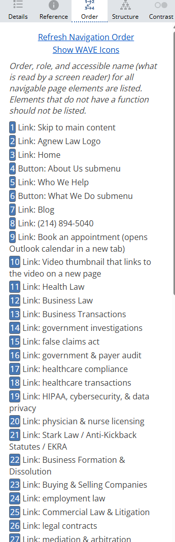
Previously, links lacked context. Now:
Every link clearly describes what it does
Screen readers receive meaningful context
Users are informed if something opens a new tab or behaves differently
For sighted users, this might seem minor. For assistive technology users, it's the difference between:
I think I know what this does
and
I know exactly what will happen
That clarity builds trust and keeps users engaged.
heading in the right direction
The original site had no consistent heading structure. The rebuild introduced a clear, logical hierarchy.
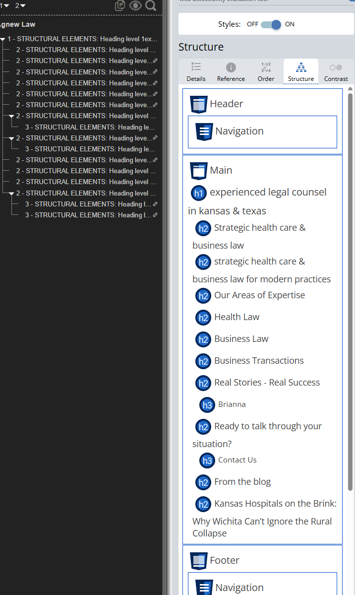
The results looks, and behaves, like an outline.
H1 = Page title
H2 = Major sections
H3 = Supporting content
Which makes sense, because that's exactly what a webpage is:
A structured argument designed to guide someone toward action
This improves:
Accessibility navigation
SEO indexing
Readability for all users
the contrast is obvious
Contrast was corrected. The old site struggled with readability, with radios as low as ~1:2.5 in some areas.
The new site:
0 contrast errors
Average ratio of 8.5:1
Exceeds WCAG AAA standards
This reduces eye strain, improves readability, and ensures the content is accessible to users with visual impairments or color blindness.
lighting the way with lighthouse
While accessibility tools tell part of the story, performance and structure matter too.
Here's how the site compared:
before

Performance: 69
Accessibility: 77
Best Practices: 100
SEO: 92
On paper, that doesn't look terrible, but it hides the real experience.
Slow load times
Poor navigation feedback
Weak accessibility
Inconsistent indexing
In practice, the site felt clunky, and users felt it.
after

Performance: 90
Accessibility: 100
Best Practices: 100
SEO: 100
And this is the key:
I didn't build the site to pass these tests.
The site passed the tests because of how it was built.
More than a score
Beyond the metrics, the rebuild introduced critical functionality the old site simply didn't have:
Dynamic sitemap that updates as content is added
Robots.txt for proper search engine indexing
Enforced alt text for all blog images
Improved crawlability and content structure
These aren't flashy features, but they're the difference between:
A site that exists
Or a site that performs
What this means for the business
All of these changes lead to one thing: A website that actually works.
Easier to navigate
Faster to load
Accessible to more users
Structured for search engines
Built to grow over time
Because at the end of the day
A website isn't some magical thing
It's just a tool, and a tool needs to work
And now, Agnew Law has one that does its job.
the upgrade phase: every story has its heroes
After the initial build was complete, I sent the site over to Matthew for review.
About a week later, we met in person, with Chandrika joining over the phone, to walk through everything together. And that's where things got interesting.
when "good" isn't good enough
Technically, the site worked:
It was accessible
It was dynamic
It performed well
It passed every test
But still felt off. On mobile, it looked and felt great. Very clean, professional, and easy to use.
On desktop?
It felt...flat.
The layout leaned too heavily on vertical spacing, and while it solved the clutter of the old site, it overcorrected. Instead of feeling clean, it started to feel empty.
That's the moment where a good client makes all the difference.
the real heroes: matthew & chandrika
Matthew and Chandrika fully engaged with the site. And more importnatly, they gave thoughtful, actionable feedback.
Some of it I expected, some of it I didn't.
what they suggested
A more readable font that better reflected their brand
A lighter, more refined blue that still met accessibility standards
A shift from vertical stacking to a more horizontal layout
Removing the homepage video and repositioning it elsewhere
Converting service links into full, clickable containers
These weren't surface-level tweaks, but they weren't deep in the structure either. They were improvements to how users experience the site.
Accessibility is experiential
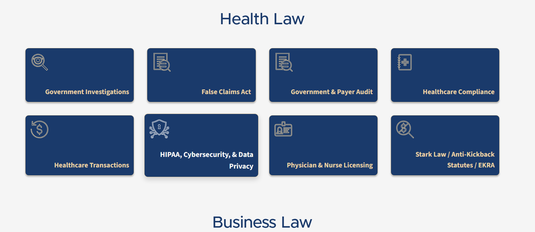
One of the most impactful pieces of feedback came from Chandrika. In the original build, service icons were purely decorative. The links existed, but the icons themselves didn't do anything when clicked.
That caused confusion.
Her exact point was simple:
This isn't really accessible, it's misleading.
And she was right.
Accessibility isn't just about passing tests; it's about meeting user expectations as well.
If something looks interactive, then it should be interactive.
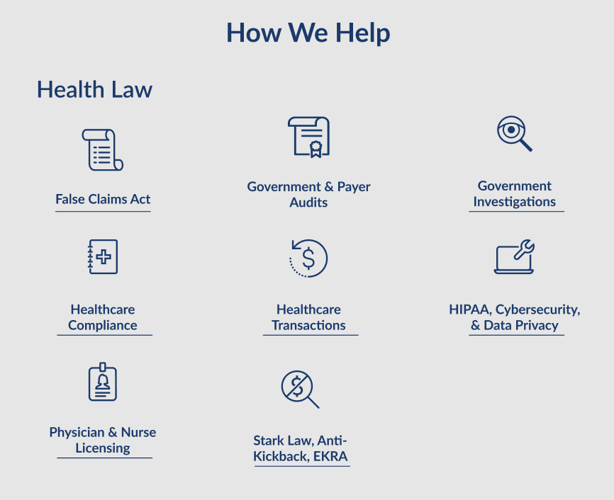
From icons to INTERFACES
The solution was to rethink how those elements worked entirely. Instead of small icons with separate links, we moved to fully clickable containers:
The entire section becomes interactive
Hover and focus states clearly indicate interactivity
Elements scale slightly to reinforce feedback
Keyboard users receive the same visual cues
This removed ambiguity and made the interface feel intuitive across all interaction types.
rethinking layout: from vertical to horizontal
The biggest shift came from layout. Both Matthew and Chandrika immediately pointed out that spacing, while nice, went too far.
The site had gone from too dense to too spread out.
To fix that, I restructured the desktop experience around a horizontal layout.
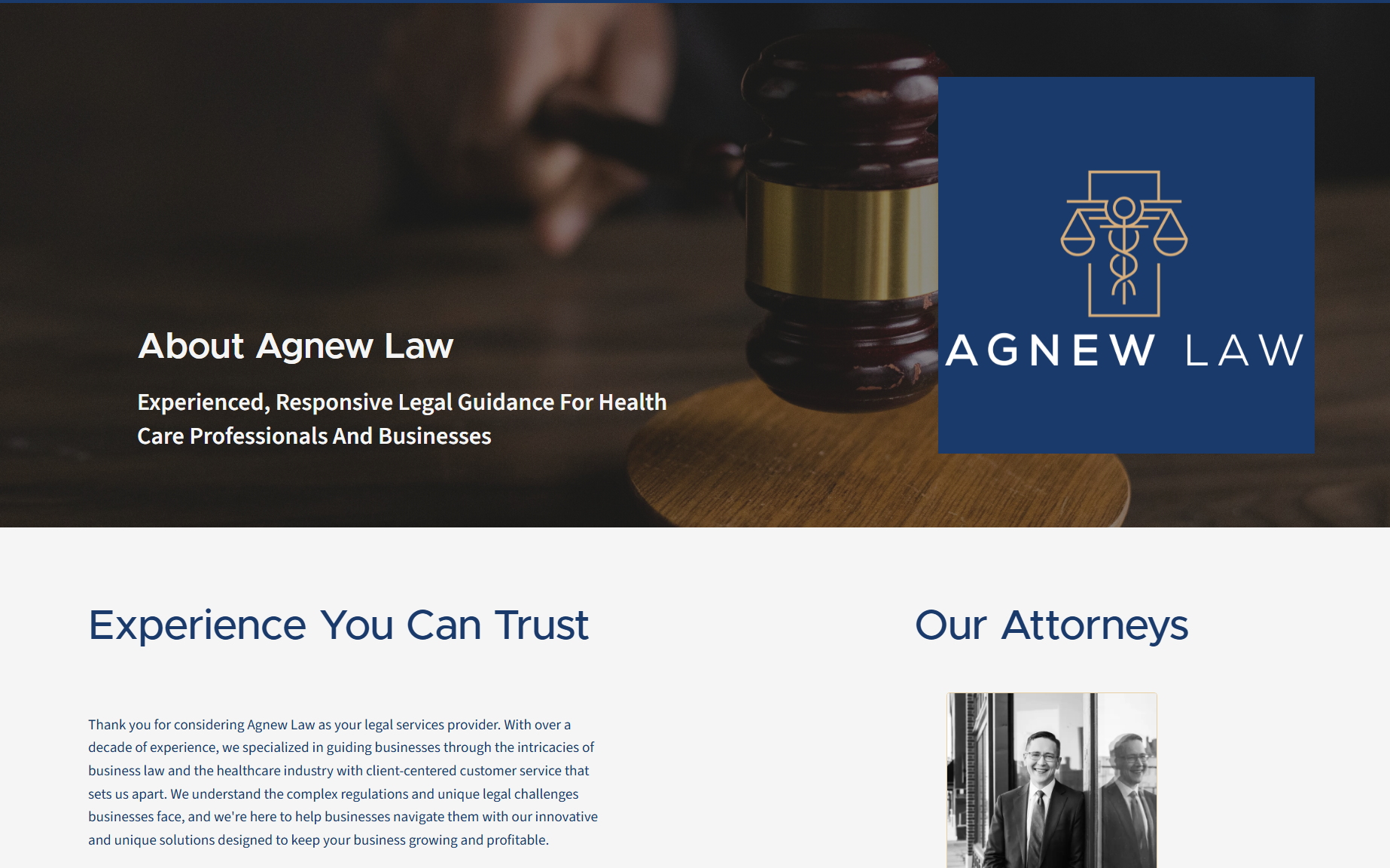
The new pattern introduced:
Background imagery to anchor sections
Clear headings and subtitles
Strong visual hierarchy
Supporting content aligned to the right
This created a more balanced, professional feel, especially on larger screens. And importantly, it maintained accessibility while improving visual flow.
a system that grows with the firm
Beyond designing improvements, the upgrade phase also reinforced one of the core goals: Making the site truly usable for business.
Matthew's firm is growing. That means the site needed to grow with it. So the system was expanded to allow:
Adding new attorney profiles without developer involvement
Creating new service categories dynamically
Expanding services as the firm evolves
Selecting from a curated (and growing) icon library
This turns the site into a living system, not a static deliverable.
client impact: more than just a website
At the end of this project, Agnew Law didn't walk away with just a better-looking website. They walked away with a system they own, understand, and can grow with.
Full control without developer dependence
One of the biggest shifts was control. Before, making even small updates required going through a developer and working within a limited builder.
Now, Matthew and his team can:
Add and update attorney profiles
Create and manage services and categories
Publish blog posts
Update reviews and content
All through a custom admin panel built specifically for how their firm operates.
A website that actually works for users
The new site doesn't just look better, it functions better too:
Navigation is clean and predictable
Content is structured and easy to scan
Interactions behave the way users espect
Accessibility is built into every page
This means:
Better usability for all visitors
A smoother experience for potential clients
Fewer drop-offs due to confusion or friction
Built for growth
Law firms evolve. Services expand. Teams grow. The old site couldn't keep up with that. The new site is designed for it.
New services can now be added without breaking the structure. New attorneys can be added and it'll generate a hyperlink for their profile page. Content can scale without needing a rebuild, allowing me to use maintenance to focus on things that matter instead of content updates.
Performance that supports the business
Speed, structure, and accessibility all tie back to one thing:
Results
Faster load times improve engagmeent. A clean structure improves search visibility. Accessibility opens a business to more users and revenue. engagement
All of this contributes to a stronger digital presence, and ultimately, more opportunities for the firm.
What this project represents
This project wasn't about just replacing a website. It was about correcting the foundation and delivering a product that properly represents its owner.
From:
A site that was difficult to use
Difficult to manage
And limited in what it could become
To:
A platform that is accessible
Performant
Scalable
And fully controlled by the business
Closing thoughts
Accessibility isn't a feature. Performance isn't a bonus. And content management shouldn't be an afterthought.
When you built those things into the foundation, everything else gets easier, both for the business and the people using the site.
That's what this project was about.
let's build something that works
If you're running a business and your website:
Feels slow
Is hard to update
Doesn't convert
Or isn't accessible
Then it's not just a website problem. It's a business problem. If you want something clean, fast, accessible, and built to actually support your business long-term, let's talk.
Share this post
Save it, share it, or follow the feed for future posts.